Quantcast
Channel: The Pen Addict
Viewing all 3494 articles
Browse latest View live

Sailor Shikiori Tsukuyo-no-Minamo Fountain Pen, Shimoyo (Frosty Night) Review

$
0
0
Sailor Shikiori Fountain Pen

(Sarah Read is an author, editor, yarn artist, and pen/paper/ink addict. You can find more about her at her website and on Twitter.)

I was in public when I first saw the new Sailor Shikiori pens hit the JetPens site. Worse than public, I was at work, where I do my best to appear as a perfectly normal human who doesn't make noises like that when they see a picture of a pen. I lost some serious cred that day--but I gained an excellent pen. So, overall, I came out ahead.

Sailor Shikiori Fountain Pen Nib

The pen build is the same as their Procolor 500 series, and very similar to the 1911 Standard—almost identical, until they are held side-by-side and examined closely. The plastic of the Shikiori feels a bit softer and the edges are a little less crisp than the Standard model. The weight is about the same. The nib on the Shikiori is gold finished steel, rather than the 14k gold of the Standard nib. I had to double check this, because the nib is so smooth and pleasant, I wasn't convinced it wasn't gold. There is a small amount of feedback with the fine nib, but in a good way. The steel nib of the Shikiori is more slender than the Standard. It looks a bit small in the pen, but it still has the beautiful Sailor branding stamped into the metal. It's the same size and shape as the Procolor 500 series, but with the added gold finish.

Sailor Shikiori Fountain Pen Comparison

It's difficult to capture the pearlescent sparkle of the material--the photos don't do this pen justice. This Shimoyo color was named for the frost that appears on ponds on a winter's night. The other colors of this series are the deep blue of the full autumn moon on the lake (Yonaga), the red of a summer night bonfire (Yodaki), and the delicate pink of evening cherry blossoms (Yozakura).

Sailor Shikiori Fountain Pen vs Sapporo

All four colors have matching inks that are just as stunning as the pens themselves. If I wasn't trying to slow the encroaching ink tide in my home, I'd have picked them up like Pokemon, but I resisted and filled mine with Akkerman #8 Diep-Duinwaterblauw. It's a good match, I think, though the ink is more greeny where the pen is a bit more grey.

If you're looking for a relatively inexpensive way to become hopelessly addicted to Sailor pens, this is a great place to start. I say relatively, because at $70, this is more of a next-level pen, rather than entry-level in terms of cost--but the experience you get for that price is an excellent value. This is definitely one of the best under-$100 pens that I own--and it's better than a few I paid over $100 for.

Sailor Shikiori Fountain Pen Review

You may have to do a little bit of hunting for these, or keep your eyes peeled for the Jetpens restock. They aren't widely available outside of Japan. I hope Sailor does more of these models in other fun themes and colors. It would help me out a lot if I could indulge in beautiful Sailors without paying for the gold nib every time, especially when the steel nibs are as nice as this one.

(JetPens provided this product at no charge to The Pen Addict for review purposes.)


Enjoy reading The Pen Addict? Then consider becoming a member to receive additional weekly content, giveaways, and discounts in The Pen Addict shop. Plus, you support me and the site directly, for which I am very grateful.

Membership starts at just $5/month, with a discounted annual option available. To find out more about membership click here and join us!

Sailor Shikiori Fountain Pen Cap

DeAtramentis Louis XIV of France, Antique Pink: A Review

$
0
0
Top Image.jpg

(Susan M. Pigott is a fountain pen collector, pen and paperholic, photographer, and professor. You can find more from Susan on her blog Scribalishess.)

King Louis XIV of France was nothing if not a man of extravagance. He commissioned numerous portraits of himself, and had the Hall of Mirrors built at Versailles to commemorate his military victories.

Photo by Susan Pigott

Photo by Susan Pigott

So, it seems fitting that DeAtramentis chose to name this flamboyant pink color after Louis XIV.

Ink Splats.jpg

Louis XIV of France (also called “antique pink”), is a lovely shade of pink. It’s not a subtle pink (just as Louis XIV was not a subtle king); rather, it is bright and cheery, much like pink roses.

Swab Card.jpg

I tested the ink using my Platinum Century 3776 with a fine nib. Platinum nibs are much finer than Western ones, so essentially the lines are like an extra fine. With such a fine line, you wouldn’t expect to find shading, and I didn’t. But the ink flowed well and had reasonable dry times. You can really see the rich color in the swab. The ink is not waterproof.

Testing Page.jpg

Chromatography demonstrates that this ink has little more than pink and dark pink in its composition.

chromatography.jpg

I compared DeAtramentis Louis XIV pink with a few other pink inks I had on hand (I am clearly not a pink person, because I struggled to find four!). Each shade is rather unique, especially J. Herbin’s Rouille d’Ancre, which reminds me of well-worn ballet shoes.

Comparison.jpg

Using my ruling pen, I wrote some nice big letters (with fabulous curlicues befitting King Louis). You can definitely see some shading using this large nib, though the ink doesn’t have any sheen.

Large Writing.jpg

King Louis of France ink is a good choice for anyone who wants a shade that is unabashedly pink. This would make a terrific Valentine’s Day ink. You can get a 35ml bottle from Vanness Pens for $14.00.


Enjoy reading The Pen Addict? Then consider becoming a member to receive additional weekly content, giveaways, and discounts in The Pen Addict shop. Plus, you support me and the site directly, for which I am very grateful.

Membership starts at just $5/month, with a discounted annual option available. To find out more about membership click here and join us!

Writing.jpg

Look out Toronto!

$
0
0
Kickstarter+Stretch A.png

Trouble is coming to town!

We hit our stretch goal for The Pen Addict Live 2018, so not only will we be recording live at the Atlanta Pen Show like we do every year, we will be heading to NYC and Toronto to cause trouble. Well, as much trouble as stationery nerds can cause.

You still have plenty of time to back this project to get in on all the rewards, which include videos, a new Nock Co. pen case design, and an amazing enamel pin set. You don't want to miss out on this one!

Thanks to everyone for your wonderful support in making this happen!

Palomino Blackwing Volumes Vol 16.2 Pencil Giveaway Winner

$
0
0

I love giving away stuff here on the blog. I especially love when the stuff in question is a personal favorite of mine. This is the case with the Palomino Blackwing Volumes Vol 16.2, one of the best Volumes releases yet. And the winner of this dozen is:

Screen Shot on 2018-02-10 at 14_35_01.png

Congrats Kara! I’ll send you an email to get your address shortly.

Thanks to everyone who entered!

Misfill, Sewer Maps Edition

$
0
0

Each week in Refill, the Pen Addict Members newsletter, I publish Ink Links as part of the additional content you receive for being a member. And each week, after 10 to 15 links, plus my added commentary on each, I'm left with many great items I want to share. Enter Misfill. Here are this weeks links:

Sewer Map

-- The 25 Principles for Adult Behavior: John Perry Barlow (R.I.P.) Creates a List of Wise Rules to Live By (Open Culture)

-- Ink Palette: Valentine Sky (Mountain of Ink)

-- Nock Co Sinclair Review (The Finer Point)

-- Inner Tube System (Crónicas Estilográficas)

-- Ghosts of the Abandoned NY Black Yankees Stadium (Messy Messy Chic)

-- A Beautiful Map of Boston's Sewers (Atlas Obscura)

-- Download 150 Free Coloring Books from Great Libraries, Museums & Cultural Institutions: The British Library, Smithsonian, Carnegie Hall & More (Open Culture)

-- Pencil Sharpeners Market Growth Analysis, Share, Demand by Regions, Types and Analysis of Key Players- Research Forecasts To 2022 (satPRnews)

-- Field Trip: Fontoplumo in Delft, The Netherlands @Fontoplum0 (Gourmet Pens)

-- Ink Review: Colorverse Mars Curiosity, Hubble Zoom & Space Laika (The Well-Appointed Desk)

Want to catch the rest, plus extra articles, reviews, commentary, discounts, and more? Try out a Pen Addict Membership for only $5 per month!

Platinum Pro-Use 171 Drafting Pencil 0.9 mm Review

$
0
0
Platinum Pro-Use 171 Drafting Pencil

While Platinum may be primarily known in pen addict circles as a manufacturer of fine fountain pens, did you know they also make high-quality drafting pencils as well?

The Platinum Pro-Use 171 is the latest to hit the market, and the best I have tried from a very good Platinum bunch. It is important to get the feel right in a drafting pencil: Weight forward towards the tip, light up top, both working together for ultimate pencil control. Platinum nails the feel with the 171.

Platinum Pro-Use 171 Drafting Pencil Grip

The lightly-knurled metal grip section looks, feels, and functions great. It has some weight to it, which it should for proper balance. The knurling provides enough grip without being too aggressive, which would tire out your fingers. It also functions to engage and disengage the pressure-absorbing spring mechanism in the pencil, which helps prevent lead breakage. With a lead as wide as 0.9 mm breakage issues aren’t all that common. I can see this coming into play more with 0.3 mm and 0.5 mm lead widths.

Platinum Pro-Use 171 Drafting Pencil Sleeve

Another feature the 171 has is an adjustable lead pipe sleeve length. This pencil does it differently than other mechanical and drafting pencils I have used with this feature. Instead of twisting to retract or extend the sleeve itself, the nose cone on the Platinum twists up and down to cover the sleeve. Functionally it’s fine, but aesthetically it’s not my favorite look when the sleeve is completely covered. It breaks up the clean lines of the pencil design.

Platinum Pro-Use 171 Drafting Pencil Spring

The stock lead the 171 ships with is not noted specifically, but it feels and performs like an stock HB lead. It’s dark and smooth and doesn’t break down too easily. The eraser is shockingly good. I never expect much from small mechanical pencil erasers, but this one takes away the marks completely and cleanly.

Platinum Pro-Use 171 Drafting Pencil Eraser

I chose the 0.9 mm size to review since I have been enjoying wider lines to sketch with. The Pro-Use 171 also comes in 0.3 mm, 0.5 mm, and 0.7 mm width, each with a different barrel color to denote the tip size. At $19 I can see avid users of drafting pencils buying the full set. The build quality of the pencil is top-notch and should last for years through heavy use. I may have to pick up the 0.3 mm to add to the collection myself. They are that good.

(JetPens provided this product at no charge to The Pen Addict for review purposes.)


Enjoy reading The Pen Addict? Then consider becoming a member to receive additional weekly content, giveaways, and discounts in The Pen Addict shop. Plus, you support me and the site directly, for which I am very grateful.

Membership starts at just $5/month, with a discounted annual option available. To find out more about membership click here and join us!

Platinum Pro-Use 171 Drafting Pencil Review

Pay-It-Forward Heart of Gold Ink Giveaway

$
0
0
Heart of Gold Ink

One of the projects I am most excited to back on Kickstarter this year is the Pay-It-Forward project. I was lucky enough to see the table in action in Washington D.C. last year, and I’m happy to call it’s creator, Oscar Rodriguez, a friend.

Oscar was kind enough to send over a bottle of Heart of Gold ink, by Papier Plume, that is part of several reward tiers in this project. Seeing how cool this ink is I couldn’t keep it to myself, so why not give it away to one lucky reader, and shine a little light on this awesome project? Read the rules below, and enter away!

Pay-It-Forward Heart of Gold Ink Giveaway Heart of Gold Ink Color

Tombow Mono Zero Eraser Review

$
0
0
Tombow Mono Zero Eraser

(Jeff Abbott is a regular contributor at The Pen Addict. You can find more from Jeff online at Draft Evolution and Twitter.)

The Tombow Mono Zero eraser is a delightful little tool that packs quite a punch when it comes to removing errors. I have several different retractable erasers, but this one actually looks professional. The classy aluminum finish paired with a rectangular body make it both visually pleasing and easy to handle.

Retractable erasers aren't known for being classy and stylish — in most cases, they're just stuffed into an art case or pencil bag for correcting the inevitable graphite mistake. I wasn't even aware I wanted a stylish eraser until I saw this thing. For less than ten bucks, you get a clean, classy eraser that actually does a great job of erasing.

Tombow Mono Zero Eraser Tip

Given the small rectangular shape of this eraser, you can use the 2.5mm sides or the 5mm sides to tackle different sized problems. Or, if you need an even more precise edge, use one of the four corners of the eraser for that fine-tuned erasing.

One of the first things I look for in a retractable eraser is how well the eraser core stays put when actually erasing. Poorly-designed erasers can be difficult to use because they tend to retract while erasing due to a lack of friction. In the case of the Mono Zero, it has no problems staying put while erasing. This is due to both the low tolerance between the eraser core and the body and the advancing mechanism. The "eraser advancer" operates similarly to a mechanical pencil. Instead of relying solely on a clutch system to advance, retract, and hold the eraser, this eraser uses a plastic rod on the interior to manage these operations. In practice, it works really well.

Tombow Mono Zero Eraser Clip

Each full click advances the eraser by about 2mm, but you can also half-click to advance the eraser by 1mm. The clip on the eraser is much stronger than it looks, and due to the light weight of the tool, it has no problem staying attached to anything to which you clip it. And, since the clip is so strong, you can clip this to the cover of a notebook. The slim profile of the eraser makes this an ideal (and probably intended?) carry option.

As far as branding goes, the Tombow logo and name are printed on only one of the four sides of the eraser body.

Tombow Mono Zero Eraser vs Sumo

I've been really impressed by this little eraser. It's not the most exciting stationery tool one can purchase, but it fulfills its purpose while also looking elgant and classy. If silver isn't your jam, you have a few other color options like black, pink, and blue.

Tombow Mono Zero Eraser Test

At just under $10, this is a great deal for a retractable eraser that uses metal parts. And, you can also pick up extra eraser cores for just a couple bucks (two erasers per pack), making this eraser sustainable as well.

If you need a retractable eraser that looks great and performs well, look no further. The Tombow Mono Zero is an excellent option.

(JetPens provided this product at no charge to The Pen Addict for review purposes.)


Enjoy reading The Pen Addict? Then consider becoming a member to receive additional weekly content, giveaways, and discounts in The Pen Addict shop. Plus, you support me and the site directly, for which I am very grateful.

Membership starts at just $5/month, with a discounted annual option available. To find out more about membership click here and join us!

Tombow Mono Zero Eraser Pencil

Zebra Funwari Fude Color Brush Pen Review

$
0
0
Zebra Funwari Dude Brush Pen

(Sarah Read is an author, editor, yarn artist, and pen/paper/ink addict. You can find more about her at her website and on Twitter.)

Brush pens are so fun, but so tricky. I learned a lot listening to Ana on the recent Pen Addict Podcast (episode 292). These Zebra Funwari Fude brush pens have the firm, reinforced felt tips she mentioned that are ideal for beginners.

The pens have a white plastic body with a snap cap that matches the color of the ink (sort of). The cap does post, but not very deeply. Overall, it's a plain design. The real feature on these is the brush point.

Zebra Funwari Dude Brush Pen Tip

The tips are felt, but reinforced with some plastic so they aren't as flexible as some. That helps a lot with line control and learning how and when to add pressure to get your desired line width. At first, they didn't seem to flex much at all, but they did break in after some use. They were still firm enough that the tip could be used to write with to get a finer line. Gentle pressure adds some width to the line, and then using the sides of the tip adds even more variation.

Zebra Funwari Dude Brush Pen Cap

All the ink colors are water-based, but the black has some extra water-resitance so that it can be used for sketching and outlining. The pens would be great for drawing or calligraphy, though I did get a little feathering where I put down more pressure.

This set includes eight colors--black, grey, red, golden yellow, green, blue, purple, and pink. It's the full color range of the model, which has a lot of gaps, unfortunately. There isn't an orange! That shouldn't be allowed.

Zebra Funwari Dude Brush Pen Writing

At $22, I do think they're a bit pricey. The overall feel and use is more school supply/beginner tool, rather than an artist's pen, but they're priced higher than some much fancier models. If you're wanting to get more into brush pen techniques,though, and struggling with the full-flex brushes, these are a great way to ease into the hobby.

(JetPens provided this product at no charge to The Pen Addict for review purposes.)


Enjoy reading The Pen Addict? Then consider becoming a member to receive additional weekly content, giveaways, and discounts in The Pen Addict shop. Plus, you support me and the site directly, for which I am very grateful.

Membership starts at just $5/month, with a discounted annual option available. To find out more about membership click here and join us!

Zebra Funwari Dude Brush Pen Flex

A Comparison of Three Modern Flex Nibs

$
0
0
Top Image.jpg

(Susan M. Pigott is a fountain pen collector, pen and paperholic, photographer, and professor. You can find more from Susan on her blog Scribalishess.)

I am on a Holy Grail search for the best modern flex nib. I realize I am doomed to fail, as modern nibs just can’t match vintage ones, but, like Don Quixote, I like to dream impossible dreams.

I did a review of the Aurora 88 Anniversario with flex nib back in March 2017. If you remember that review, I wasn’t much impressed. But, because I am a nutcase, I became obsessed with owning the blue Aurora 88 Anniversario in spite of the fact that I wasn’t impressed with its flex. I believe I bought the last blue Aurora 88 flex on earth. Isn’t it gorgeous?

Blue Aurora.jpg

I purchased a Pilot 912 with FA nib a long while ago and reviewed it here. It’s a great pen, and I love the FA nib.

Pilot 912.jpg

And, recently, I purchased a Franklin-Christoph 14k SIG flex nib. I put it in my Iterum 03 reviewed here.

Franklin Christoph.jpg

Since I own three modern flex nibs, I thought it would be fun to compare them. I realize that various factors make this review less than scientific. First, I used different inks in each pen, and ink can affect line width due to variances in viscosity and saturation. But, I used different inks mainly so I could more easily distinguish the pens. Second, although I tried to use the same pressure with each pen, there’s no way to guarantee exactitude with the human hand. The Aurora, in particular, required quite a bit more pressure to get some flex. Third, the three nibs are quite distinct though all are made of gold. The Aurora nib relies on the flexibility of long tines to create line variation. The FA nib and the Franklin-Christoph nib both use cutouts to increase line variation.

Pilot Nib.jpg FC Nib.jpg Aurora Nib.jpg

I compared the nibs with various writing tests. First, I did swirls.

Pilot

Pilot

Franklin-Chistoph

Franklin-Chistoph

Aurora

Aurora

In this test, the Pilot 912 with FA nib definitely showed more line variation. The Franklin-Christoph SIG flex nib came in second with good line variation, and the Aurora was last with the least line variation. Plus, the feed didn’t keep up with the flex resulting in railroading.

My second test was writing the “Quick Brown Fox” line. Here, the differences between the nibs isn’t as obvious. The Pilot still wins first place for line variation, but the Franklin-Christoph and Aurora are very similar

Pilot

Pilot

Franklin-Christoph

Franklin-Christoph

Aurora

Aurora

In the third test, I simply drew vertical lines while flexing the nib. Once again, the Pilot provides the most flex, measuring a little over 1mm, but the Franklin-Christoph and Aurora were pretty similar, both just under 1mm.

Pilot

Pilot

Franklin-Christoph

Franklin-Christoph

Aurora

Aurora

After comparing these three modern flex nibs, I have to give first prize for line variation to the Pilot 912 with FA nib. This nib simply flexes more easily and with more line variation than the other two nibs.

FA Nib Flexing.jpg

The Franklin-Christoph SIG Flex Nib gets second place. Not only is this nib a pleasure to write with, it offers good line variation and the nib can be used in any Franklin-Christoph pen that accepts a size #6 nib. Unfortunately, when I use my FC SIG flex nib for regular writing (such as when I’m taking notes in class), it has a tendency to dry up and require a little tongue lick (I know, gross) to get the ink flowing again. Still, I love the bounce that the cut outs give, and the pen itself is light and easy to write with.

FC Nib Flexing.jpg

In third place is my very expensive Aurora 88 Anniversario. I just cannot get this nib to flex without putting lots of pressure on it. That said, it is my favorite pen of the three, mainly because it is a piston filler and it’s blue. What can I say? I love blue pens and Aurora nibs are incredibly well made. True, the Aurora struggles as a flex nib. Of the three, it was the only one that railroaded. But, as an every-day writer, the Aurora is excellent.

Aurora 88 Flexing.jpg

After comparing these three modern flex nibs, my conclusion is that the Pilot FA nib is the best nib for creating line variation using flex. If you want a more interesting pen design, then I suggest you go with any Franklin-Christoph model that accepts their #6 SIG flex nib. I still cannot recommend Aurora’s flex nib if you want excellent line variation. It simply requires too much pressure and the feed does not adequately supply ink when you use flex (thus, the railroading).

Writing Sample All Three.jpg

That said, Aurora is offering flex nibs in their newest Optima models. If you really want an Aurora flex nib, I encourage you to purchase one from Dan Smith. He can tweak the feed and nib for better flex and ink flow.

You can purchase the Pilot Custom Heritage 912 from Vanness Pens for $225.00. Although most (if not all) of the Aurora 88s with flex nibs are sold out, Optimas will be available in March (retail $650), and I suggest you contact Dan Smith to pre-order one of these. Franklin-Christoph offers numerous pen styles that accept the #6 SIG flex nib. Prices vary between models.

**Author’s note: My comparison omits one other modern flex pen: the Wahl-Eversharp Decoband (reviewed here). In terms of flex, this pen surpasses all three of the pens I reviewed above. However, two factors made me decide not to include it in this comparison. First, it truly is an oversized pen, much larger (and heavier) than the three pens discussed above. Second, it is a great deal more expensive (retail $850) than the other pens, especially the Franklin Christoph and the Pilot 912. Please read my review if you think an oversized pen would suit you best.

Bottom Image.jpg

Pokka Jakket and Dokk Accessories Review

$
0
0
Pokka Jakket Review

(Jeff Abbott is a regular contributor at The Pen Addict. You can find more from Jeff online at Draft Evolution and Twitter.)

As 2020 is nearing the end, many of us are still spending most of our time in our homes instead of out and about. But just because you're staying home doesn't mean you can't carry a pen around at all times. There are so many great pocket pens to choose from, but today we'll focus on the Pokka Pen — an affordable and "disposable" pocket pen that's only 3.25 inches long when closed. When open and posted, the pen is 5.5 inches long, making it very comfortable to use. And, while it's advertised as a disposable pen, you can actually purchase additional refills (and multiple colors) for when it's time to replace the ink refill.

Pokka Jakket

Pokka Pens have been around for a few years now, and I've enjoyed using them myself and giving them as gifts. They're so small and easy to throw in places where you might need a pen at some point (like a glove box in a car or a bag or purse), but also affordable enough that you can purchase a few without breaking the bank. While I prefer the Fisher Bullet, it doesn't make much sense to purchase multiples at a time. And this is exactly the problem that Terry O'Connor was trying to solve. He was tired of buying and losing his Fisher pens!

Pokka Jakket Cap

Pokka Pens are affordable because they're made using injection molded plastic materials and standard ballpoint refills. The refills are very similar to what you'll find in any Bic ballpoint pen, which isn't fantastic but is at least very dependable and long-lasting.

Lately, Pokka Pens have released some more durable caps and accessories for their mini ballpoint pens: the Jakket and Dokk.

Pokka Jakket Pen

The Jakket is an all-aluminum replacement cap that fits any Pokka Pen. The aluminum is machined and fairly robust without adding any weight. There are some machines grooves that run along the length of the cap to provide some visual interest and extra grip, but I notice every time I use it just how sharp the edges of the grooves are. I could probably fix this with some fine grain sandpaper to knock down the microscopic sharp edges, but it's not annoying enough to merit the tedious chore of sanding something so small. Maybe a future revision would include some kind of smoothing down of the edges of the grooves to make them more pleasant to hold and handle.

Outside of the material and shape differences, the Jakket operates exactly like any regular Pokka Pen cap. It fits the pen body and post mechanism perfectly thanks to the snap and o-ring system (dubbed Double Dokk). The Jakket is just a few millimeters longer than the normal cap, but it's not enough to make much of a difference when storing or using.

Pokka Dokk

The Dokk is a small bit of aluminum that snaps onto the back of the Pokka Pen and adds a convenient lanyard point to any Pokka Pen. The Dokk shares the same machined look as the Jakket and looks right at home when combined. When using both the Jakket and Dokk together, the overall length of the closed pen is about half an inch longer than the standard plastic Pokka Pen. Again, not a substantial size difference.

The convenience of being able to attach the Pokka Pen to other things is fantastic. The Dokk includes a small split ring, but I've just been using a small carabiner that was laying around. The carabiner is much easier to use than a split ring, and adds a bit more versatility. If you want to attach it to a lanyard, the split ring is perfect.

Pokka Dokk Pen

When you're using both the Dokk and Jakket, it actually works best if the Dokk is attached to something else, like a lanyard, keyring, bag, or something else. That way, you can just pull the larger Jakket to remove the pen from whatever you've attached the Dokk to. In most cases, only the Jakket comes off the pen, and then you have to pull the plastic Pokka Pen out of the Dokk, post the cap, and then start writing. Some times, the pen comes out with the Jakket. I wish it always did this, but either way you need to post the Jakket to the back of the pen before using it. Given the design, I don't see an easy way to ensure that the pen always stays attached to the Jakket when removing it from the Dokk. Not a big deal, big something to consider if the big use case you have in mind doesn't line up with this behavior.

Pokka Comparison

Overall, the Jakket and Dokk are a great addition to an already rugged and extremely portable pen. At $8.95 for the Jakket and $4.95 for the Dokk, they're a decent deal for what you get (solid machined aluminum!). It sounds expensive when compared to the regular Pokka Pen prices, but this comes down to materials. The aluminum will definitely add a lot of durability to the pen, and the mounting point that the Dokk provides adds a lot of versatility to you can use this sleek little pen. Pick up a combo of the Jakket and Dokk with your next Pokka Pen order! The Jakket and Dokk come in silver (pictured here) or anodized black as well.

(Pokka Pens provided this product at no charge to The Pen Addict for review purposes.)


Enjoy reading The Pen Addict? Then consider becoming a member to receive additional weekly content, giveaways, and discounts in The Pen Addict shop. Plus, you support me and the site directly, for which I am very grateful.

Membership starts at just $5/month, with a discounted annual option available. To find out more about membership click here and join us!

Pokka Pens

What My 2020 Planner Has Been Through

$
0
0
2020 Planner Cancelled

(Sarah Read is an author, editor, yarn artist, and pen/paper/ink addict. You can find more about her at her website and on Twitter. And check out her latest book, Out of Water, now available where books are sold!)

It's been a rough year for us all. No one's come through unscathed. My planner is no exception. Sometimes I go back and look through my old planners, and I couldn't help but wonder what it might be like, years from now, looking back at this book of my 2020 life.

It started off normal. I had a planner party in November last year, where a handful of friends brought their stationery over and we all decorated and prepped our planners for a productive year. Welp. That was the last time I had a gathering of friends, and all the plans we planned went awry.

2020 Planner Dates

I have lost count of how many times I had to plan my plans, change my plans, reroute everything and turn it all upside down. When things got scary in March, My work closed, the schools closed--I had to figure out how to watch my kids and supervise their learning while working from home. We thought it would be a rough few weeks, and then we'd get back to normal. I had a few trips rescheduled. I had to cancel hotels and flights. They were moved to later dates, so I rebooked it all. Then my work opened back up, and I had to change all my shifts so someone was always home with my kids, who were still doing school from home. And then all the rescheduled events started toppling like dominoes.

2020 Planner Scratch

This pattern repeated several times. Everything I wrote was crossed out at least twice. Somewhere in the summer, I gave up. There are about seven weeks where I just stopped writing anything down.

Then my own school started! And I had to live by the planner. There was too much to organize, and too much to remember, and it all needed to be written down, or it would be forgotten--except things were still shifting and changing. Quarantines crept in and shook the schedule again. And on every page are my attempts to stay on track, to keep control. Mostly those didn't work out.

2020 Planner Vote

I'm running out of pages in the planner, now. My ribbon bookmark is shredded and it's a whole mood. A new planner sits on my desk with no idea what's coming for it. Do I really think 2021 is going to be any less chaotic? I don't know.

2020 Planner Frayed

I thought, at first, that maybe I should do my planning in pencil this year. But I like my crossed-out plans, my scribbled-out appointments, my arrows that lead to nowhere, and even the pages where I stopped trying to control the situation. It's all the documentation of resilience and flexibility--the things we all needed just to make it this far in 2020. One thing I will change in my 2021 planner is that I'll leave more open space--room for change to happen.


Enjoy reading The Pen Addict? Then consider becoming a member to receive additional weekly content, giveaways, and discounts in The Pen Addict shop. Plus, you support me and the site directly, for which I am very grateful.

Membership starts at just $5/month, with a discounted annual option available. To find out more about membership click here and join us!

2020 Planner Cover

The Pen Addict Podcast: Episode 435 - Fine Fine Medium Line

$
0
0
Carolina Pen Co. Bestseller

Happy Fountain Pen Day! Myke and I talk about the best holiday for pen people, and how I did my part with a little retail therapy. We also discuss the “Bestseller,” interesting Kaweco designs, and answer your #ASKTPA questions.

Show Notes & Download Links

This episode of The Pen Addict is sponsored by:

ExpressVPN: High-Speed, Secure & Anonymous VPN Service. Get an extra three months free.

Pen Chalet: Click the ‘podcast’ link at the top of the website and enter the password ‘penaddict’ for this week’s special offer, and to get your code for 10% off.

The Sketchnote Ideabook: A Review

$
0
0
The Sketchnote Ideabook: A Review

(Susan M. Pigott is a fountain pen collector, pen and paperholic, photographer, and professor. You can find more from Susan on her blog Scribalishess.)

The Sketchnote Ideabook is made by AirshipNotebooks.com for Mike Rohde, who wrote two books (The Sketchnote Handbook and The Sketchnote Workbook) on how to take notes using the Sketchnote method.

The notebook is A5 size (5.8" x 8.3") with a polyurethane hardcover in gray. The cover is soft to the touch and adorned with icons, Sketchnote and Airship branding, and the "Ideas Not Art" logo.

The Sketchnote Ideabook Review

It has a band closure in teal, two book ribbons (one teal, one orange), and a back cover pocket.

Sketchnote Ideabook Review

The 160 gsm blank paper (128 pages) is almost as thick as card stock. The pages are sewn with a lay-flat binding and the corners are rounded. The last four pages are perforated. The first two have large boxes for icon drawing reference, the third has small boxes, and the last is blank to use as a blotter. I forgot to take pictures of these pages, but you can see them on the Ideabook website.

Sketchnote Ideabook

The front and back end pages contain a brief introduction to the Sketchnote method, including the five basic elements of drawing and Sketchnoting patterns. Having easy access to these instructions is helpful.

Sketchnote Ideabook Patterns

The design of the "This Book Belongs To" page isn't appealing, with the "Reward for Return" (as if) and the drawing of Mike Rohde. Sorry, Mike. I'm sure you're a great guy, but I don't really want your likeness in my notebook.

Sketchnote Ideabook Title Page

Although the paper is thick and smooth, it's not meant for fountain pens. In my tests with eleven pens and inks, I found that, although the ink didn't bleed through much, it did feather.

Sketchnote Ideabook Fountain Pen Test
Sketchnote Ideabook Feathering
Sketchnote Ideabook Feathering 2

Ink swabbing also demonstrated that this paper isn't meant for fountain pens. The colors of the eight inks I tested are crisp, but the paper absorbs the ink and doesn't exhibit any sheen or shading. Plus, the inks bled through slightly, and the paper puckers. Although the Ideabook website says, "You'll love this paper," I don't love it--not for fountain pens, anyway.

Sketchnote Ideabook Swab
Sketchnote Ideabook Swab Bleed

I tested a variety of non-fountain pens. The paper handled them well, with the exception of the Sharpie Magnum, but no one expects mega-Sharpies not to bleed. The fine point Sharpie didn't bleed through at all.

Sketchnote Ideabook Pen Test
Sketchnote Ideabook Sharpie

I used my Lamy 2000 (fine nib) inked with Iroshizuku Kiri-Same to try my hand at Sketchnoting. First, I practiced the five basic elements of drawing.

Sketchnote Ideabook Notetaking

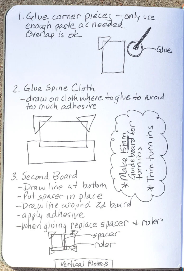
Then I watched a YouTube video by DAS Bookbinding on how to case bind a hand-sewn book. For the first two-page spread, I used the Radial Notetaking method. My pages turned out pretty messy, and I had to stop the video several times to write down the details I wanted. The Sketchnote method didn't hinder me. Rather, the instructions in the video were given too quickly for me to keep up. During lulls in the video, I added little pictures of the tools required and utilized some of the recommended drawing methods.

Sketchnote Ideabook Two Page Spread
Sketchnote Ideabook Notes

I varied my note taking methods during the course of the video. On my third page, I used the Vertical Notes method.

Sketchnote Ideabook Page Three

For the fourth page I used the Path Notetaking method.

Sketchnote Ideabook Page Four

I've always been a visual notetaker. I doodled in the margins while taking notes in school, but I never thought to incorporate doodles into the note taking itself. The Sketchnote method combines note taking with simple drawings to create a visual result. This is especially helpful when you're trying to retain information because drawing and writing create pathways to your brain.

I am, however, very much tied to words, and the Sketchnote method emphasizes writing only the main points, not all the details. I can't take notes that way. I need the details, such as the measuring formulas given in the video I watched. With practice I think I could let go of writing full sentences and focus more on using key words and drawings. I'm going to continue using my Ideabook while watching bookbinding videos to practice sketchnoting. But I will switch to a ballpoint pen or pencil instead of a fountain pen.

You can purchase the Sketchnote Ideabook at Airship Notebooks for $24.00 plus shipping.

(Airship Notebooks provided this notebook free of charge for Pen Addict to review. This post also contains Amazon affiliate links.)


Enjoy reading The Pen Addict? Then consider becoming a member to receive additional weekly content, giveaways, and discounts in The Pen Addict shop. Plus, you support me and the site directly, for which I am very grateful.

Membership starts at just $5/month, with a discounted annual option available. To find out more about membership click here and join us!

Sketchnote Ideabook

Fountain Pen Day Giveaway: Esterbrook Estie Sparkle Winner

$
0
0

Did you have a glorious Fountain Pen Day? I know you did! But maybe, MAYBE, not as glorious of a day as the winner of this awesome Esterbrook Estie Sparkle fountain pen. And the winner is:

Esterbrook Estie Sparkle Winner

Congrats Stephanie! I’ve sent you an email to collect your shipping address.


Misifll, Do or Do Not Edition

$
0
0
Baby Yoda

Each week in Refill, the Pen Addict Members newsletter, I publish Ink Links as part of the additional content you receive for being a member. And each week, after 10 to 15 links, plus my added commentary on each, I'm left with many great items I want to share. Enter Misfill. Here are this weeks links:

”Do or Do Not" Notebook by Skylab Letterpress + The Well-Appointed Desk (Tools and Toys)

Why Use A Fountain Pen? (An Inkophile's Blog)

Field Notes 5e Character Journal Hands-On Impressions (Game Rant)

Tools for drawing pictures on notebooks (Travelers Diary)

PREVO the Zine: The Thoreau Set. (Pencil Revolution!)

Review: Pencil Revolution The Zine (Comfortable Shoes Studio)

A stick of plastic with a nib on the end (UK fountain pens)

Handwriting with the Esterbrook Estie Journaler Nib (Gourmet Pens)

Worth the Hype? A Close Look at a Montblanc Writers Edition (Virginia Woolf) (The Gentleman Stationer)

Shimmer inks don’t just do fancy handwriting (Nick Stewart)

Leonardo Officina Italiana Cuspide Fountain Pen Review (SBREBrown)

Fountain Pen Quest Trail Log – November 8, 2020 (Fountain Pen Quest)

Working Tools 49. Timeblocking (Stuart Lennon)

Instant Lettering: A Letraset Database (swissmiss)

Ink Review #1299: Robert Oster Barossa Gilt (Mountain of Ink)

Nigel Shafran's Notebooks (Notebook Stories)

What's Up with the Platinum Carbon Desk Pen? (The Well-Appointed Desk)

A Big Walk, Book Success, Work as Protest (Roden Explorers Archive)

Deadlines, Challenges and NaNoWriMo (Writing at Large)

Want to catch the rest, plus extra articles, reviews, commentary, discounts, and more? Try out a Pen Addict Membership for only $5 per month!

Sailor Compass 1911 Fountain Pen Review

$
0
0
Sailor Compass 1911 Fountain Pen Review

(Jeff Abbott is a regular contributor at The Pen Addict. You can find more from Jeff online at Draft Evolution and Twitter.)

The sub-$100 price range can be difficult for a lot of pen manufacturers to succeed in. For some, this is where they excel at offering great value and excellent writing instruments for the price (ever heard of TWSBI?). On the other hand, being able to deliver high-end luxury writing instruments doesn't also make you an expert at delivering lower cost, affordable items that compete well with brands that operate exclusively in that space. That doesn't mean you shouldn't try, though! And that's exactly what Sailor is doing with the Compass 1911 fountain pen line.

Sailor Compass 1911 Fountain Pen

The Compass 1911 borrows a familiar shape from the high-end 1911 fountain pen line, but uses more affordable materials in order to hit a much lower price bracket: $50 MSRP. On top of that, the Compass 1911 even comes with two black ink cartridges and (wait for it) a cartridge converter. I've definitely criticized Sailor in the past for not including a cheap converter with their $200+ fountain pens. At that price range, it seems petty to discount it from the hinged box that contains the pen. In the $50 price range, it's a fantastic bonus that I would never expect.

Sailor Compass 1911 Fountain Pen Nib

But the value gets better from there since no one really sells goods for the MSRP. As of now, you can find the Sailor Compass 1911 for just under $40 at Goldspot. For that price, is an excellent value for a beginning fountain pen kit. But, how does it perform as a pen? Can Sailor scale down their excellent writing to an ultra affordable, entry-level pen?

Across the lineup, the Compass 1911 feature semi-transparent materials in a variety of fun colors. The trim is silver in every case, and there also aren't any nib choices to make. Every pen comes with a stainless steel medium fine nib. While this is a bold decision, I certainly agree with this being a default option for a nib size. Others won't appreciate it and will look for larger or smaller alternatives, but for most people that don't really know what nib size to use yet, it's a pretty good starting point.

Sailor Compass 1911 Fountain Pen Converter

The pen is fairly lightweight, but doesn't feel brittle or delicate. It can definitely withstand some abuse from being thrown in bags and pockets. The screw-on cap posts securely to the back of the pen, and I find it extremely comfortable to write with the cap posted or non-posted. Both lengths are great for writing. In all, the materials used in the body and cap feel great for such an affordable pen. Even the converter seems well-made.

Moving on to the more important part of the pen, the nib is incredibly plain compared to Sailor's more expensive options. Even though it's plain and looks a little cheap, this nib is a solid performer. The MF nib is stiff as a nail and writes smoothly and reliably. It's always such a joy to ink up a pen straight out of the box and find that it writes beautifully without any fuss. The Sailor Compass 1911 is one of these pens, and an excellent first option for those that are curious about the world of fountain pens. I also enjoy that the material used for the feed is transparent as well, which shows off the ink color you've chosen. For my Olive version of the pen, I went with Pilot Iroshizuku Chiku-rin to compliment the light green transparent color of the body. The green feed just makes it even better.

Sailor Compass 1911 Fountain Pen Comparison

To be honest, I wasn't sure what to expect when I opened this box. I've been disappointed in the past by some of Sailor's sub-$100 offerings, and I thought this might be another lackluster attempt to break into that price range. The Compass 1911 won't disrupt what TWSBI, Pilot, Lamy, Kaweco, or other brands that offer pens in the same price range are already doing, but it is a fantastic offering from the brand that directly translates what kind of quality and dependable writing experience you can expect from their more luxurious offerings. Here's to hoping they continue experimenting in this fun category.

The review unit featured here is the Olive color option, but you can also pick from Clear, Brown, Yellow, Green, Purple, Blue, Pink, and Red. At $40, they're a fantastic deal for a gift or a personal treat.

(Goldspot provided this product at no charge to The Pen Addict for review purposes.)


Enjoy reading The Pen Addict? Then consider becoming a member to receive additional weekly content, giveaways, and discounts in The Pen Addict shop. Plus, you support me and the site directly, for which I am very grateful.

Membership starts at just $5/month, with a discounted annual option available. To find out more about membership click here and join us!

Sailor Compass 1911

King Jim Magflap Clipboard Review

$
0
0
King Jim Magflap Clipboard Review

(Sarah Read is an author, editor, yarn artist, and pen/paper/ink addict. You can find more about her at her website and on Twitter. And check out her latest book, Out of Water, now available where books are sold!)

The King Jim MagFlap Clipboard is one of the best stationery items I have ever owned and I do not say that lightly. By the time I was in my second week of grad school, and realized that I would be reading a minimum of 500 pages of scholarly articles every week, I knew two things: 1) I could not do that much reading on a screen. 2) I was going to need a way to contain, transport, and highlight a lot of papers all day every day. So I requested one of these. I've named her Maggie and she's my partner in crime. We go everywhere together, even from room-to-room in the house. If you have any need at all for a portable writing surface, I recommend this one.

King Jim Magflap Clipboard

The clipboard is thin, but very sturdy with no flexibility, so you can hold it at one corner and still write on a firm surface. The clip is very strong and goes the whole width of the top, so the corners of your document are protected and secured. At the bottom, there is a magnetic flap that closes over the bottom edges of the papers, so they do not flip up or fly around, and it keeps the entire page secured. There is another magnetic flap on the back of the clipboard, so when you finish a page, you can flip it up and over the clip, and secure it at the back, so it isn't dangling and it is protected from getting tattered.

King Jim Magflap Clipboard Clipped

The magnets are very strong, so nothing slips or slides around. Watch your fingertips, though, because they are strong enough to pinch a bit. It can also be attached to metal surfaces, like a refrigerator. While the specs say it holds 10-30 sheets, I can attest to it holding much more than that securely with no trouble at all. I know I've carried at least 50 pages at a time in it with no issues, and the clip is still holding strong.

King Jim Magflap Clipboard Flap

The one thing this clipboard is missing is some kind of pen loop. If it could also securely hold my highlighter, it would be the most perfect thing ever. As it is, it's still very great. I think it would be perfect not just for students, but also artists, office workers, or anyone who has to do a lot of writing on their feet, like nurses or teachers. It isn't cheap at $14.50, but it is totally worth it. I might even need a backup or two, and one for the fridge as well.

(JetPens provided this product at no charge to The Pen Addict for review purposes.)


King Jim Magflap Clipboard Fold

The Pen Addict Podcast: Episode 436 - Pens Take Precedence

$
0
0
Current status. Image via  Melissa Nilsson .

Current status. Image via Melissa Nilsson.

Broken bones have been my Loch Ness monster throughout my life, as in, do they really exist? Well, I found out the hard way last weekend. Sailor may not have found a monster, but they certainly have created one with their recent release schedule. What does it all mean?

Show Notes & Download Links

This episode of The Pen Addict is sponsored by:

Squarespace: Make your next move. Enter offer code PENADDICT at checkout to get 10% off your first purchase.

Ooni Pizza Ovens: Bring the world’s best pizza to your own backyard. Use the code THEPENADDICT for 10% off.

Pineider Avatar UR Demo Fountain Pen in Amber: A Review

$
0
0
Pineider Avatar UR Demo Fountain Pen Review

(Susan M. Pigott is a fountain pen collector, pen and paperholic, photographer, and professor. You can find more from Susan on her blog Scribalishess.)

The Pineider Avatar Fountain Pen is made of a new material called "UltraResin" (thus the UR in the title). According to the pamphlet included with the pen, UltraResin is a mother of pearl compound resin that is resistant to breaks, oil, ink, variations in temperature, and UV rays. The company compares it to celluloid, stating that it has all the features of celluloid without the problems, such as crystallization and susceptibility to heat.

The pen comes in a classic-looking cardboard box, which contains the pen, the pamphlet, and instructions.

Pineider Avatar UR Demo Fountain Pen

The Avatar is 3D engineered so that it can be assembled without any glue. Trims are palladium plated, including the bottom tip.

Bottom Tip.jpgPineider Avatar UR Demo Fountain Pen Bottom

The clip is designed to resemble a quill and is spring loaded.

Pineider Avatar UR Demo Fountain Pen Clip

The cap band is engraved with the Pineider name and the skyline of Florence, Italy.

Pineider Avatar UR Demo Fountain Pen Cap Band

Using a sealed magnet, the cap locks securely merely by placing it onto the barrel--no twisting or fiddling necessary.

Pineider Avatar UR Demo Fountain Pen Converter
Pineider Avatar UR Demo Fountain Pen Ink Level

A converter is included with the pen. It has the Pineider logo on it and an ink level gauge as well.

Measuring 5.79 in/147mm (capped), 5.24 in/133mm (uncapped), and 6.46 in/164mm posted, the Avatar is a medium-sized pen. It is rather heavy at 30 grams (capped/posted) and 17.8 grams uncapped/unposted. The cap posts securely but makes the pen unbalanced in the hand. I liked the weight and balance of the pen unposted.

Pineider Avatar UR Demo Fountain Pen Capped

For comfort, the grip is covered in rubber, which does make it easy to hold while writing. However, ink somehow seeped beneath the rubber grip and stained it. Pineider's website states that the grip can be replaced easily, but I have no idea how to remove it.

Pineider Avatar UR Demo Fountain Pen Grip
Pineider Avatar UR Demo Fountain Pen Grip Ink

I'm quite confused about the nib. The pamphlet included with the pen states that the nib is a "large N6 Demi Flex." However, both the Pineider website and Goldspot identify it only as a steel nib. It has a futuristic look to it with the Pineider name engraved decoratively on both sides of the nib.

Pineider Avatar UR Demo Fountain Pen Nib

If this is supposed to be a "Demi Flex" or "Semi Flex" nib, it certainly does not live up to the name. There's absolutely no give to it at all. I tried applying some pressure to produce line variation and this is what resulted:

Pineider Avatar UR Demo Fountain Pen Lines

Otherwise, the fine nib writes smoothly, even though the tines are a bit misaligned.

Pineider Avatar UR Demo Fountain Pen Tines

I used Bungubox Sweet Potato Yellow to create my writing samples. The ink flowed well, and the writing experience was pleasant. However, the cap apparently doesn't seal completely, because after leaving the pen unused, I experienced hard starts--actually no starts. I had to force ink down into the nib unit in order to begin writing again. Other than that problem, I experienced no skipping, scratchiness, or other issues.

Pineider Avatar UR Demo Fountain Pen Alphabet
Pineider Avatar UR Demo Fountain Pen Letters
Pineider Avatar UR Demo Fountain Pen Writing

The Pineider Avatar is a beautifully designed pen. You can really appreciate the engineering that went into it when you examine it closely. The palladium plated accents complement the pen, and I particularly like the easy on and off cap.

Although the rubber grip offers a soft and stable surface for your fingers, the fact that ink can get underneath and stain it is disappointing. I'm not particularly fond of the ink level measurement on the converter and don't see why it's necessary at all, especially with a demonstrator pen.

I haven't tried dropping the pen to see if it lives up to its "almost unbreakable" description, but the UltraResin material does seem substantial in the hand. That said, the company's claim that UltraResin is comparable to celluloid isn't convincing, at least for the demo models. The opaque models (in various colors) look a bit more like celluloid.

You can purchase the Pineider Avatar UR in Amber for $157.95 from Goldspot.

(Goldspot provided this product at no charge to The Pen Addict for review purposes.)


Enjoy reading The Pen Addict? Then consider becoming a member to receive additional weekly content, giveaways, and discounts in The Pen Addict shop. Plus, you support me and the site directly, for which I am very grateful.

Membership starts at just $5/month, with a discounted annual option available. To find out more about membership click here and join us!

Pineider Avatar Fountain Pen Review
Viewing all 3494 articles
Browse latest View live